

The first thing one thinks of when presented with a layout design is how the implementation will be. Over the years, this implementation has been tricky with CSS because all that was there to use was just float and positioning. Getting these properties to correctly style a page and also make it responsive across different screen sizes has been a real headache.
In 2017, after a lot of back and forth with Flexbox and Grid, they both became W3C recommended making them gain widespread support of major browsers. This was a game changer in the development world, styling complicated web layouts became much easier.
Now with Flexbox and Grid becoming really popular and widely used, the decision of which between the two to use in styling became the next headache for many developers. In this article, I will try to explain how both works and also give suggestions on which to use in different scenarios.
Prerequisite
It’s important to note that this article does not in full detail teach both Flexbox and Grid but shows the power these two layout systems possess. For those that are completely new to Flexbox and Grid, you can get up to speed with the Net Ninja tutorial playlist for both Flexbox and Grid.
Now that you have an idea of what to expect, let’s jump right into it!
What is CSS layout?
CSS layout refers to the process of arranging and positioning HTML elements on a web page using CSS. CSS layout involves defining rules for the placement, sizing, and styling of various elements such as text, images, and other HTML elements.
CSS layout can be used to create a wide variety of page layouts, from simple designs with basic elements to complex, multi-column designs. Some common CSS layout techniques include using Float, Flexbox, and Grid.
What is Flexbox?
Flexbox is a powerful one-dimensional CSS layout system that has become increasingly popular in web development in recent years. It allows you to create dynamic, flexible layouts that can adapt to different screen sizes and devices, without the need for complex CSS or JavaScript. With Flexbox, you can easily align, distribute and reorder content in a way that was previously difficult or impossible to achieve with traditional CSS layout methods(float, positioning).
Generally, the introduction of Flexbox changed the whole layout system of the web. These changes came with a lot of upsides. Let’s take a look at some of the upsides.
Flexible and Responsive Layouts: Flexbox brought a lot of flexibility when it comes to creating and making layouts responsive across different screen sizes and device types.
Cross-Browser Compatibility: Flexbox is supported by all major web browsers, including Chrome, Firefox, Safari, and Edge. This means that you can use Flexbox to create layouts that will work consistently across different devices and platforms.
Flexible spacing: Flexbox has made the control of spaces between elements easier to achieve. With its properties and features like justify-content and align-items, you could have full control of the spacing between elements.
Easy to use: The availability of numerous tutorials and the simplicity of Flexbox code makes it easy to be picked by a beginner in a matter of hours.
Efficient Use of Space: Flexbox allows you to make more efficient use of available space on a webpage or application. By using Flexbox, you can create layouts that automatically adjust the size and position of elements based on available space, without the need for complex calculations or positioning rules.
Even though Flexbox's introduction was a big turning point in layout design, it wasn’t able to solve all the design problems, hence it has its downsides. Let's take a look at some of them.
Limited Two-Dimensional Layout: Flexbox is primarily designed for one-dimensional layouts, such as rows or columns. While it can be used to create two-dimensional layouts, such as Grids, it may not be the most efficient or effective solution for these types of layouts.
Complex Nesting: Flexbox can become complex and difficult to manage when used in nested layouts with multiple levels of containers. This can make it harder to maintain and debug code, especially if you have a large and complex website or application.
Limited Browser Support for Older Browsers: While Flexbox is supported by all major modern browsers, some older browsers may not support it fully or at all. This can limit the use of Flexbox in certain situations, especially if you need to support a wide range of devices and platforms.
What’s CSS Grid?
CSS Grid is a powerful multi-dimensional CSS layout system that is used to create layouts with flexible rows and columns where elements can be arranged in their desired positions.
Just like Flexbox, the introduction of the Grid layout system came with a lot of benefits and upsides to the front-end development part of the web. Let’s take a look at some of these upsides.
Simplified Code: You can write more simplified code by reducing the need for nested HTML elements and complex CSS hacks. This helps in the creation of complex layouts with fewer lines of code, making it easier to maintain and update.
Flexibility and Control: You can create complex and custom layouts with greater flexibility and control. Grid allows for the creation of rows and columns of any size and shape, with the ability to position and align content precisely within grid cells.
Grid-based layouts are responsive by default: You can easily specify how layouts should adapt to different screen sizes and devices.
Grid items placement: You can easily control the placement of grid items without affecting the layout of other elements when using Grid. This allows for more efficient design and a better user experience.
Accessibility: You can create more accessible websites using Grid by making it easy to define visual and structural relationships between elements, without having to use complex markup.
As useful as CSS Grid seems to look, it does still end up with some potential downsides while using it. Let’s take a look at some of them.
Performance issues: Although CSS Grid can be very efficient when used correctly, it can also potentially create performance issues if not implemented properly. For example, using too many nested grids or overly complex layouts can slow down page load times and decrease user experience.
Learning curve: CSS Grid has a steeper learning curve than some other layout systems, which means that you may need to invest more time and effort into learning how to use it effectively.
Complexity: CSS Grid can be more complex to implement than some other layout systems, especially for those who are not familiar with the CSS Grid syntax. This can lead to longer development times and potentially more errors in the code.
Use cases
For Flexbox
Flexbox has so many use cases. We will be looking at a few of them. Let’s get into it.
Navigation bar: Setting up the navigation layout using floats and positioning was a real headache for developers. This is one major problem Flexbox came to solve. It’s now something that can now be done without over-calculating. Let’s go through a typical example of this.
HTML Code
  <nav>
      <ul>
        <li><a href="#">Page 1</a></li>
        <li><a href="#">Page 2</a></li>
        <li><a href="#">Page 3 is longer</a></li>
        <li><a href="#">Page 4</a></li>
      </ul>
   </nav>
CSS Code
  nav ul {
    display: flex;
    justify-content: space-between;
    width: 50%;
    margin: 0 auto;
  }
  li{
    padding: 10px;
    border: 2px solid black;
    list-style: none;
    background-color: rgba(96, 139, 168, .2);
    border-radius: 10px;
  }
  a{
    text-decoration: none;
    color: black;
    font-size: 20px;
  }
Output
In the example above, Flexbox was used to position the navigation items.
Justify-content: space-betweenwas used to give an equal amount of space between these items. You can change how the space is distributed using thespace-aroundvalue, or where supported,space-evenly. You could also useflex-start to place the space at the end of the items,flex-endto place it before them, or centre to centre the navigation items. There are a whole lot of adjustments that can be done, and this is possible because of the use of Flexbox.Centre Item: If you’re very used to the tech space, a lot of developers joke about how hard it is to centre an item in the middle of the page. You get questions like “Can you centre a div?”😅. When using Flexbox, it’s something that can be achieved with three lines of CSS code. Let’s take a look at it.
HTML Code
    <div class="box">
      <div></div>
    </div>
CSS Code
  .box {
    display: flex;
    align-items: center;
    justify-content: center;
    height: 100vh;
  }

  .box div {
    width: 100px;
    height: 100px;
    border: 2px solid black;
    background-color: rgba(96, 139, 168, .2);
    border-radius: 10px;
  }
Output
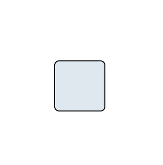
As you can see from the example above, it’s very straightforward to “centre a div”. All that’s needed is to make a container into a flex container, and then use either
align-itemson the parent element or target the flex item itself withalign-self.

These are two out of the many other use cases of Flexbox out there. The moment you begin to use it more often, you will start seeing the pattern and way in which Flexbox works its magic.
For CSS Grid
One stand-out advantage that CSS Grid has is its ability to work multi-dimensionally. This makes it possible for it to be used for multi-dimensional layouts that are difficult to achieve with other layout tools. For example, you can create a grid with multiple rows and columns, each with different widths and heights.
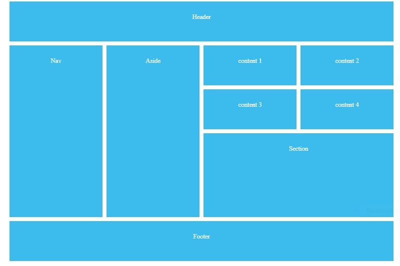
Creating this type of complex layout with another layout format will be difficult and will require you to do a lot of nesting in the HTML code. Let’s take a look at how this was achieved with CSS Grid.
HTML Code
  <div id="content">
    <header>Header</header>
    <div class="content-1">content 1</div>
    <div class="content-2">content 2</div>
    <div class="content-3">content 3</div>
    <div class="content-4">content 4</div>
    <section>Section</section>
    <aside>Aside</aside>
    <nav>Nav</nav>
    <footer>Footer</footer>
  </div>
CSS Code
#content{
        display: grid;
        grid-template-columns: repeat(4, 1fr);
        grid-auto-rows: minmax(100px, auto);
        max-width: 960px;
        margin: 0 auto;
        grid-gap: 10px;
        grid-template-areas:
          'header header header header'
          'nav aside content1 content2'
          'nav aside content3 content4'
          'nav aside section section'
          'nav aside section section'
          'footer footer footer footer'
        ;
    }
    #content > *{
      background: #3bbced;
      padding: 30px;
    }
    header{
      grid-area: header;
    }
    .content-1{
      grid-area: content1;
    }
    .content-2{
      grid-area: content2;
    }
    .content-3{
      grid-area: content3;
    }
    .content-4{
      grid-area: content4;
    }
    aside{
      grid-area: aside;
    }
    section{
      grid-area: section;
    }
    nav{
      grid-area: nav;
    }
    footer{
      grid-area: footer;
    }
From this example, grid-template-area was used to achieve this. When you take a look at the HTML code, it’s clear to see how simple and clear it was written without nesting.
This particular use case here is the most common use case when it comes to CSS Grid.
Flex or CSS Grid, which should you use and when?
Making this decision before the start of this article might have been tricky, but after going through both of these layout systems you probably have an idea of when to use each of them. That being said, let’s make the ideas that are forming stick.
Use flexbox when:
You need to create a layout that flows in one direction. For example, when you need to create a row of items or a column of items.
You want to align items within a container. You can easily align items vertically or horizontally, centre them, or even distribute them evenly along a particular axis.
Use CSS Grid when:
You need to create a grid-like layout, such as a spreadsheet or a magazine-style layout. This is because it allows you to create rows and columns with precise control over their size and placement.
You have a complex layout that requires multiple levels of nesting, because it allows you to create a grid structure with multiple layers of nested grids, which is hard with Flexbox.
You have items with fixed sizes, such as images or videos, because it allows you to create a grid structure with fixed column and row sizes, which can help align-items.
Conclusion
CSS Grid and Flexbox are powerful layout systems that have their strengths and use cases. The choice between these two layout systems depends on the specific requirements of your project.
If you are looking to create a grid-like or complex layout, then CSS Grid is the better option as it offers precise control over the layout's rows and columns. On the other hand, if you want to create a linear and flexible layout, then Flexbox is a better option as it allows for easy alignment and distribution of items along a single axis.
In general, Flexbox is best suited for simpler and more linear designs, while CSS Grid is ideal for more complex and grid-like designs. Both have their strengths, and learning how to use them effectively will help you create beautiful, responsive, and dynamic web designs.
Ultimately, the choice between CSS Grid and Flexbox comes down to the specific needs of your project. With a good understanding of the strengths and limitations of each layout system, you can choose the one that best suits your design goals and make the most of its features.
Now that you have gone through this article, it's time to build things more frequently with these two layout systems.